
You, the User: What Informs Your Preferences?

As new trends and technologies rise in popularity, companies compete fiercely for users' attention. Though they all offer similar services, each company strives to distinguish itself while dancing around infringement. While pricing and features are often seen as the deciding factors, small details—like user interfaces and interaction design—can have a significant impact on a user’s decision-making process. These seemingly minor differences can determine whether a user remains loyal to a service or switches to a competitor. When developing a product, it’s important to empathize with users and pay attention to feedback. Let’s explore a few popular services that you’ve likely already formed an opinion on.
Doordash vs. UberEats
Meal delivery services have become convenient staples in recent years, and among competition there are many reasons why one service might be chosen before another. Perhaps your favorite local restaurant is only available on one platform, or you’re visiting a country where your go-to app isn't offered. But when all else is equal, how does a customer develop a preference?
Using two popular choices as an example, I prefer Doordash over UberEats. When I open the app and go to my ‘profile,’ I’m presented with my favorite restaurants and recently viewed places—an easy way to find what I like. In contrast, UberEats displays a settings page with numerous buttons, which feels less intuitive. Additionally, DoorDash offers browsing suggestions, whereas UberEats presents a blank page when I tap “browse.”
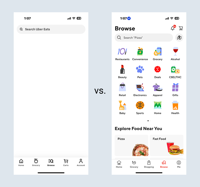
Browse Page (Left: UberEats, Right: Doordash)

Account Page (Left: UberEats, Right: Doordash)
These subtle differences in design make a real impact; I always tap on the Doordash app first, meanwhile UberEats has offloaded itself from my phone due to inactivity. One frustrating experience can taint a user’s perception of a service, just as a positive experience can establish a user’s loyalty for years to come.
Netflix vs. Hulu
We’ve all seen the subscription fees for multiple streaming platforms add up. As costs increase, users need to make careful decisions about which services to keep. While some choices are dictated by exclusive content—if your favorite show is only available on a particular service, you’ll likely stick with it—others are influenced by user experience.
Take Netflix, for example. I appreciate that the "Continue Watching" section is prominently placed towards the top, making it easy to pick up where I left off. On Hulu, I have to scroll down to find this option, which feels less efficient.

Netflix Home Page - “Continue Watching” in second row

Hulu Home Page - “Continue Watching” is not pictured because it’s further down the page
Hulu likely decided that the best choice for their business is to push its original content, while Netflix chose to prioritize the user’s experience. However, Netflix's decision to limit password sharing has driven many users to reconsider the value of its service. Netflix gets a point in it’s column for its interface, but loses points for denying users the budget-friendly experience they’re used to. Users are constantly adding and subtracting these points in their minds as they decide what services are worth their patronage.
TikTok vs. Reels
Short-form video content has captivated audiences and kept users scrolling for probably longer than they’d like to admit. When TikTok first gained popularity, users could abstain from this type of content by simply not downloading the app. But now, this type of content is available across almost all social media platforms. So, how do these platforms differ in delivering this content?
I personally prefer TikTok, since I like to share videos with my friends and the interface allows me to swipe through these easily. On Instagram Reels, however, if multiple videos have been sent to mem, I must open each individually, navigating back to the thread in between videos.
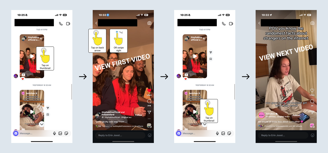
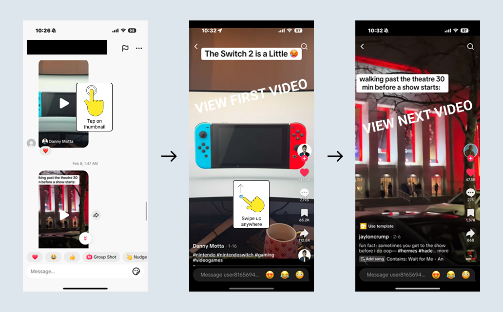
TikTok
As you can see in the above illustrations, it is easier to scroll through multiple videos in a thread on TikTok. This difference, though small, becomes exponentially greater the more videos are sent in a row and the more a user partakes in the messaging feature.
The Importance of Details
Ultimately, decisions between competitors have always been based on experience. Take a grocery store as an example: Trader Joe’s may have a unique stock, but its small stores can create bottlenecks and long lines, causing customer frustration. In the same way, digital products are shaped by these small details that influence usership.
Every day, consumers weigh various factors when deciding where to spend their time and money. Whether it’s a meal delivery app, streaming service, or social media platform, users are making constant observations, whether consciously or subconsciously. Businesses need to pay close attention to these preferences, as even small tweaks in user experience can have a profound impact.
Conclusion
To create successful products, the mind must be attuned to minor details. By thinking about your own preferences and how they were formed, you’re on your way to a deeper understanding of users and building better experiences. At the end of the day, I am a user and you are too.
If a simple thought exercise can help you tap into a user’s mindset and help you make informed decisions, imagine how much can be revealed by thorough interviews, surveys, and testing. At Moser Consulting, we recognize the profound impact of minor features and excel at understanding user mindset. Contact us to take advantage of our research expertise to help you avoid pitfalls and craft enjoyable experiences!
Discover YOUR perfect UX package today. Contact MoserUX for more information at marketing@moserit.com.