
UX Design Fails: The Cost of Ignoring User Experience
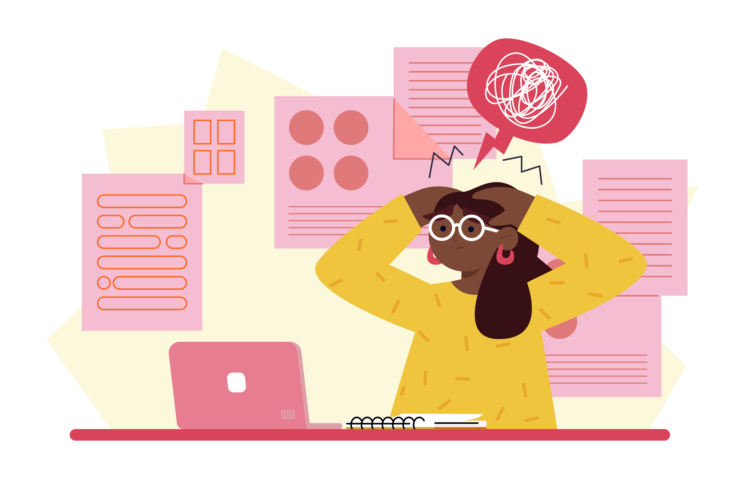
Imagine trying to use your favorite website or app only to find yourself completely frustrated by its design. Maybe buttons were in a weird place, menus were hard to navigate, or something just didn’t work the way you expected. These moments are more than just annoying, they’re a clear sign of a UX design fail.
What is a UX Design Fail?
UX design fails happen when a website or app falls short of user expectations, creating unnecessary barriers and confusion. While some of these failures are small annoyances, others can drive users away entirely. Below we’ll take a look at a collection of design missteps, ranging from hilariously bad UI to serious user experience failures that have real-world consequences
Let’s start by checking these hilariously awful UI creations made by a group of developers competing for who can make the worst designs in the world.
Volume Control without Boundaries
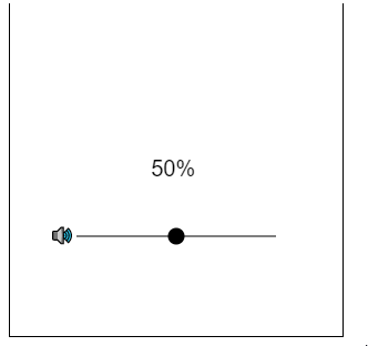
Open VolumeControl.gif (r/badUIbattles, 2020)
Are You Sure You Want to Unsubscribe?
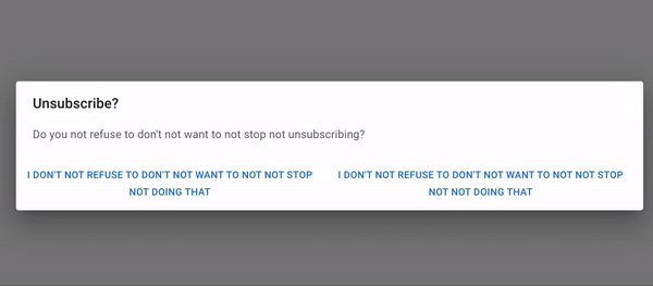
Open ConfusingUnsubscribe.gif
(r/badUIbattles, 2023)
“Real” Dark Mode

Open RealDarkMode.gif
(r/badUIbattles, 2020)
A Fun Way to Select Your Birthday
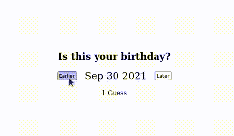
Open IsThisYourBirthday.gif
(r/badUIbattles, 2022)
Real World UX Design Fails
Now, let’s shift to some real-world examples and breakdown why they are fails. From confusing interfaces to features that left users feeling frustrated and helpless. The following real-life mistakes remind us that no one is immune to a UX design fail.
Overcomplicated CAPTCHAs
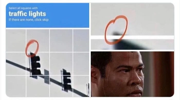
Open Captcha.jpg
(@uwaiis_, 2020)
Why it’s a Fail:
CAPTCHAs that require users to solve complex puzzles or select multiple images often lead to frustration and abandonment of tasks. Overly difficult or repetitive CAPTCHAs disrupt the user flow, especially on mobile devices, where touch gestures are less accurate.
The Impact:
These CAPTCHAs create delays in completing tasks like purchases or sign-ups and cause user irritation, leading many to leave the site. Overuse of CAPTCHAs can also result in unnecessary bot-detection prompts, making users feel doubted or inconvenienced.
The Solution:
Websites should use simpler, background CAPTCHA solutions like reCAPTCHA v3, which minimize interruptions and improve accessibility, offering a smoother experience for users.
Amazon's "One-Click Ordering"

Open amazon1clickl.png
(How-To Geek, 2017)
Why it’s a Fail:
In the early days of Amazon, their “One-Click Ordering” feature was innovative, but it had a major flaw: It made impulse purchasing too easy, leading some customers to accidentally purchase items without realizing it.
The Impact:
Users were unintentionally buying products they didn’t want, leading to frustration, returns, and complaints.
The Solution:
Amazon has implemented a better system that includes a confirmation step before finalizing the order, ensuring that the user is fully aware of their purchase.
Netflix’s Auto-Preview Feature
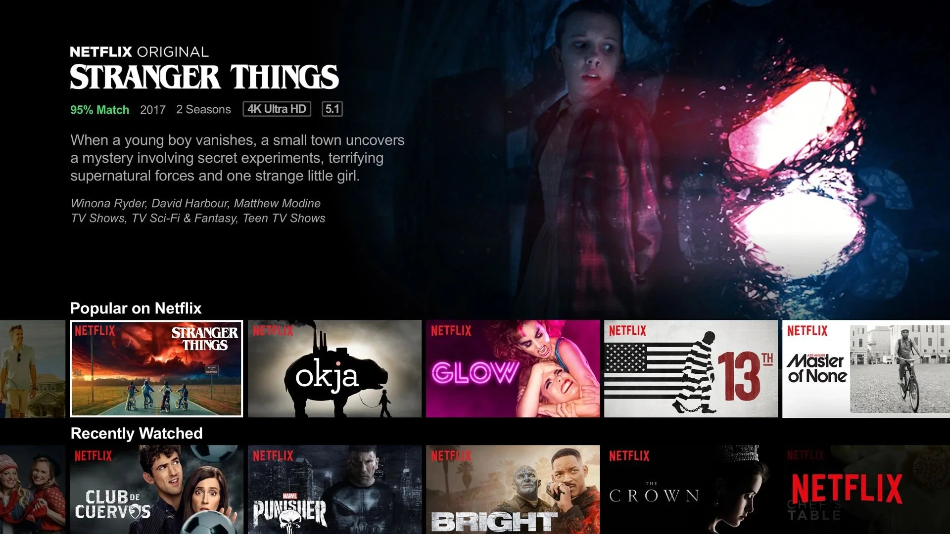
Open NetflixTrailerAuto.webp
(Fast Company, 2019)
Why it’s a Fail:
On Netflix, hovering over a show’s thumbnail automatically plays a trailer with sound, which can be jarring, especially when users are just browsing. This unexpected audio-visual content can disrupt the browsing experience, especially in quiet environments.
The Impact:
The feature creates a disruptive experience for users who are merely skimming through options without wanting to engage with trailers or sound. It leads to frustration and can even cause embarrassment in shared spaces or quiet settings.
The Solution:
Netflix has somewhat improved the experience recently by adding an option to disable auto-play previews, but this is only currently available for desktop and mobile versions. Having this option gives users more control over their browsing experience and ensure a more user-friendly and comfortable interaction.
Elevator Without Braille for Visually Impaired Guests
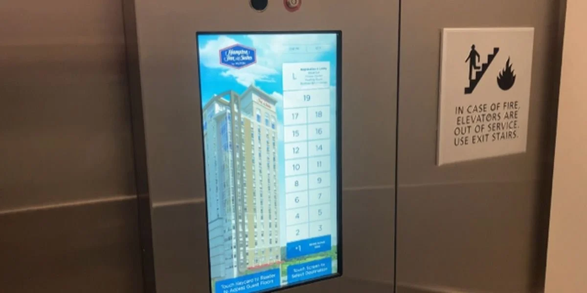
Open 13099724_WANFHotel.JPG
(ABC Eyewitness News, 2023)
Why it’s a Fail:
A visually impaired man encountered a significant UX design failure during his stay at a hotel in Atlanta. The elevator in the hotel lacked essential braille labels on its control panel, making it impossible for him to use independently. While the elevator had a touchscreen interface, it did not provide any accessible verbal instructions or tactile feedback for blind users. This omission failed to consider the needs of people with disabilities, specifically those with visual impairments.
The Impact:
The man felt vulnerable and scared, trapped for several minutes. This highlights a major accessibility oversight, failing to meet ADA standards and creating a dangerous experience for disabled users.
The Solution:
Elevators should have braille on all buttons, clear verbal instructions, and tactile feedback. Hotels must design with accessibility in mind to ensure all guests can safely and independently use the facilities.
How to Avoid Your Own UX Design Fail
If you’re looking to steer clear of these pitfalls and create seamless, user-friendly designs that keep your users happy, Moser Consulting is here to help. Our team of experts specializes in creating intuitive, accessible, and engaging digital experiences. Contact us using the link below to discuss how we can enhance your user experience and elevate your design!
Discover YOUR perfect UX package today. Contact MoserUX for more information at marketing@moserit.com.