
"You Are Not the User": Designing for Seniors in a Digital World
As a UX designer and researcher, I spend a lot of time advocating for empathy and inclusivity in design—but sometimes, the most powerful reminders come not from a research session, but from the people closest to us.
This past Father’s Day, I had an experience with my dad that unexpectedly turned into a case study in accessibility, poor interface design, and the importance of designing with older users in mind.
Like many people working in tech, I’ve long been my parents' unofficial IT support. With every new phone update, confusing app change, or suspicious pop-up, I'm the first call. And while it can be frustrating at times, it's also become a special part of our relationship—one that inspired the theme of this year’s Father's Day card.
My dad had been having trouble with his Yahoo Mail app. He couldn’t find his sent emails or drafts and was worried that his outgoing messages—many for his small business—weren’t actually being sent. My parents, who only use phones and an iPad, were convinced these features had just vanished. I even logged into his account on my laptop to confirm everything was working fine.
But they didn’t believe it until I was physically there. When I finally got to look at the app in person, I saw the issue: tiny up and down arrows had been added to the inbox icon. Clicking it revealed the other folders like Sent, Drafts, and Spam. It took me all of three seconds to notice. But for my dad? It might as well have been hidden in the code.
These arrows were so subtle—so easily missed—that my parents were sure the app was broken. I couldn’t help but wonder: had any user testing been done with older adults on this update?

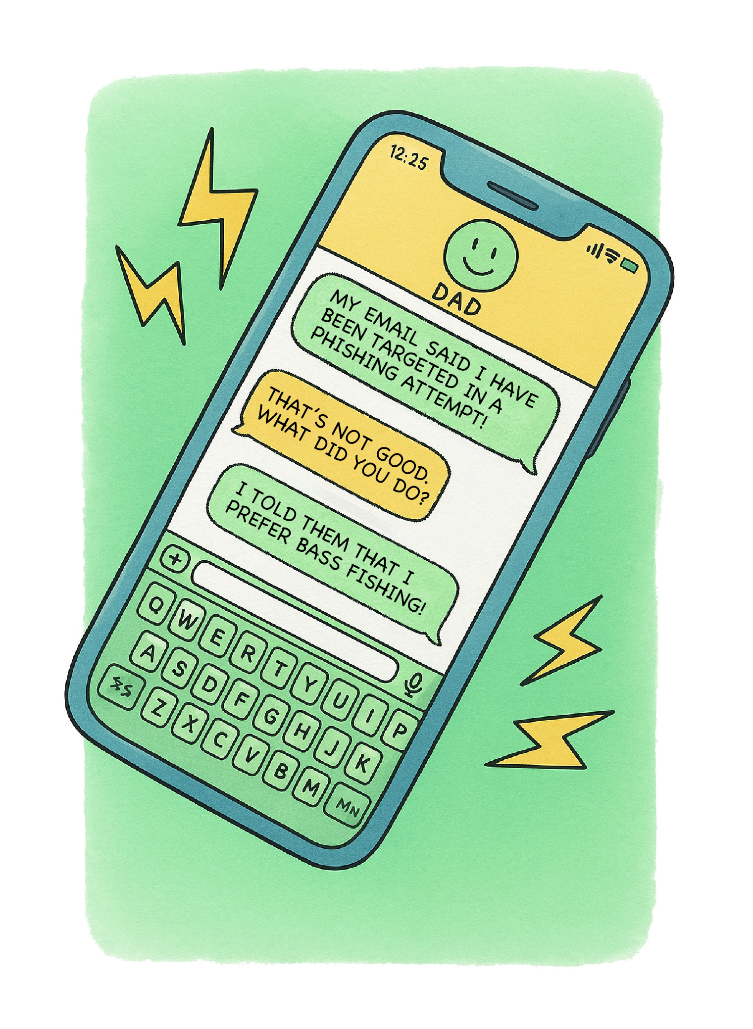
Later that day, I gave my dad the card I’d made. It featured a cute little cartoon of a phone conversation that went:
Dad: “My email said I’ve been targeted in a phishing attempt!”
Me: “That’s not good. What did you do?”
Dad: “I told them I prefer bass fishing!”
I expected a laugh. Instead, I got a puzzled look.
He didn’t get it.
He didn’t know what "phishing" with a PH meant.
As I explained the joke, it lost all its punch—and I had one of those moments of UX clarity:
We are not our users.
The False Consensus Effect in UX
The False Consensus Effect is a cognitive bias that leads us to believe that others think the same way we do. As user experience consultants, we see this all the time.. We assume users know what "phishing" means. We assume they’ll find a hidden arrow intuitive. We assume everyone is as comfortable with tech as we are. But they’re not and the numbers prove it.
According to Pew Research, 34% of adults over 65 report being “not at all” or “not too” confident when using electronic devices to perform online tasks.
Nearly 40% of older adults say they need assistance when setting up or using a new device.
Vision and dexterity decline with age, making small touch targets and low contrast interfaces increasingly difficult to use.
That little arrow that confused my dad? It failed both accessibility standards and inclusive design—and would never have passed an audit focused on website accessibility or web handicap compliance.
Why Designing for Older Adults Matters
The aging population is rapidly growing. By 2030, 1 in every 5 Americans will be over the age of 65. This is not a niche audience—this is a massive, underserved user base.
Designing for older adults isn’t just about making things “bigger” or “simpler.” It’s about:
Ensuring touch targets are large enough for aging hands.
Writing copy that’s clear, jargon-free, and doesn't assume technical fluency.
Designing interfaces with accessibility and discoverability in mind.
Conducting user research with elderly participants—not just guessing at their needs.
A Lesson Wrapped in a Dad Joke
My Father’s Day card didn’t land like I expected—but the lesson behind it hit me harder than any punchline could. We can’t keep assuming our users will just “figure it out.” As user experience design firm know, we can’t design in a bubble, testing only on people who are tech-savvy and under 40. We need to do better by conducting meaningful research and designing inclusively—for everyone, especially the people who raised us.
If you’re building digital products and want to ensure they’re usable, inclusive, and accessible for all users—young and old—Moser Consulting is here to help. Our team provides custom UX solutions, UX consulting for enterprises, and user experience consulting across industries including government, education, retail, and healthcare.
Whether you need support with user interface improvements, accessibility audits WCAG 2.2, or full-scale website modernization, our Indianapolis UX designers and researchers can guide you with proven UX best practices.
Let us help you design better. Because you are not the user—but we can help you understand them. Contact Moser Consulting today to elevate your UX strategy.
Discover YOUR perfect UX package today with our team of Indianapolis UX designers and remote UX specialists. We offer user experience consulting, custom UX solutions, and website accessibility upgrades to help your organization move forward.
Contact MoserUX for more information at marketing@moserit.com.